Torch AR App
Torch AR boiled down the complexity of 3D game engines like Unity into a simple, powerful mobile no-code application. The app enabled creators to design and publish augmented reality experiences to app stores and social platforms.
We interviewed over a hundred world-class developers and creatives from companies like Adobe, Meta, Google, Wieden+Kennedy, Magic Leap, and more. The struggle to prototype and publish immersive experiences was real with obstacles at every turn. Due to a lack of cohesive tool sets among internal product teams, designers and developers struggled to collaborate and test concepts before diving into costly production with high fidelity assets in a game engine. These insights, which we published in several white papers, drove the creation of Torch AR.
As the Design Director at Torch, I led cross-functional teams through the product development life cycle, managing both engineers and a small, but high performing design team that included myself. I worked directly with the CPO to craft the product roadmap and with the CTO to coordinate, plan and manage feature and technical debt sprints. I also led the initial design of the Torch brand and marketing website, which was recognized as one of Webflow’s top 20 website designs of 2018.
Torch was acquired in 2020 by Fyusion, a 3D computer vision and machine learning company focused on the automotive space.
Role
Design Director, Product Manager, Co-Designer, Concept, UX/UI Design System, Website, Brand Development, Design Strategy.
Brand Development
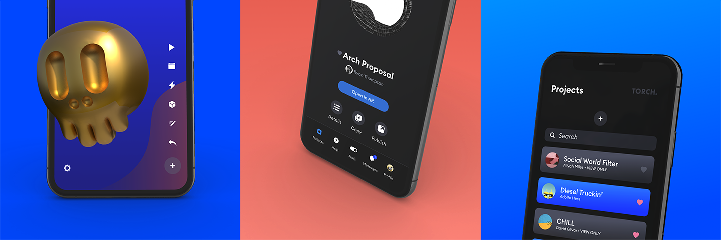
In addition to building the product UI & UX systems from scratch, we designed and built a brand system complimentary to the app as well as responsive website(s)—our marketing site was voted as one of Webflow’s top ten websites.
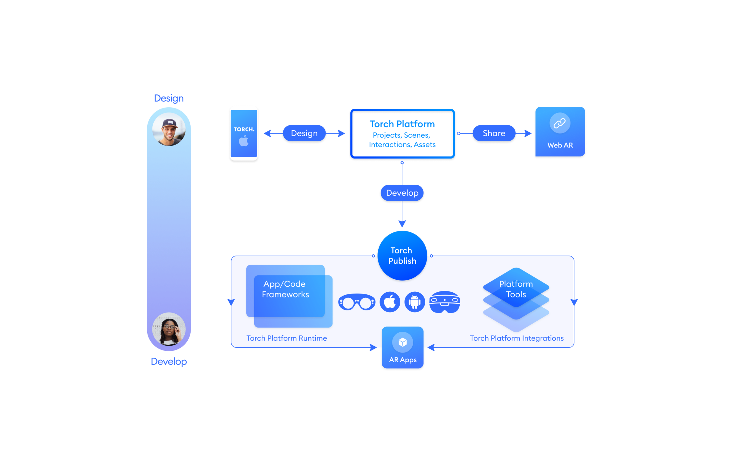
Consumer facing diagrams give design and engineering teams a holistic view of Torch's capabilities
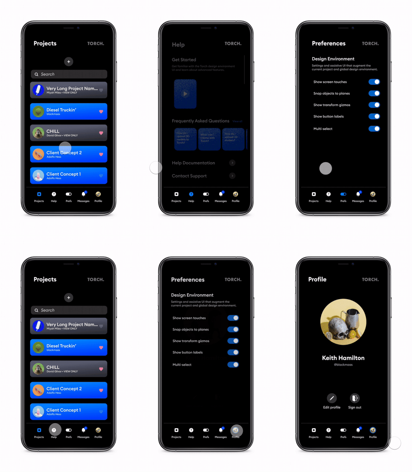
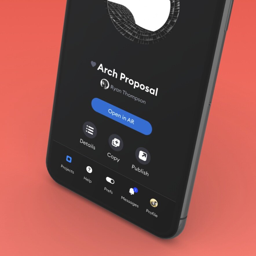
The app is divided into two core contexts: management and design.
Designers and enterprise teams are slowly introduced to AR via familiar 2D UI and onboarding paradigms that allow easy and intuitive project and design preference management before diving into designing in the camera feed.
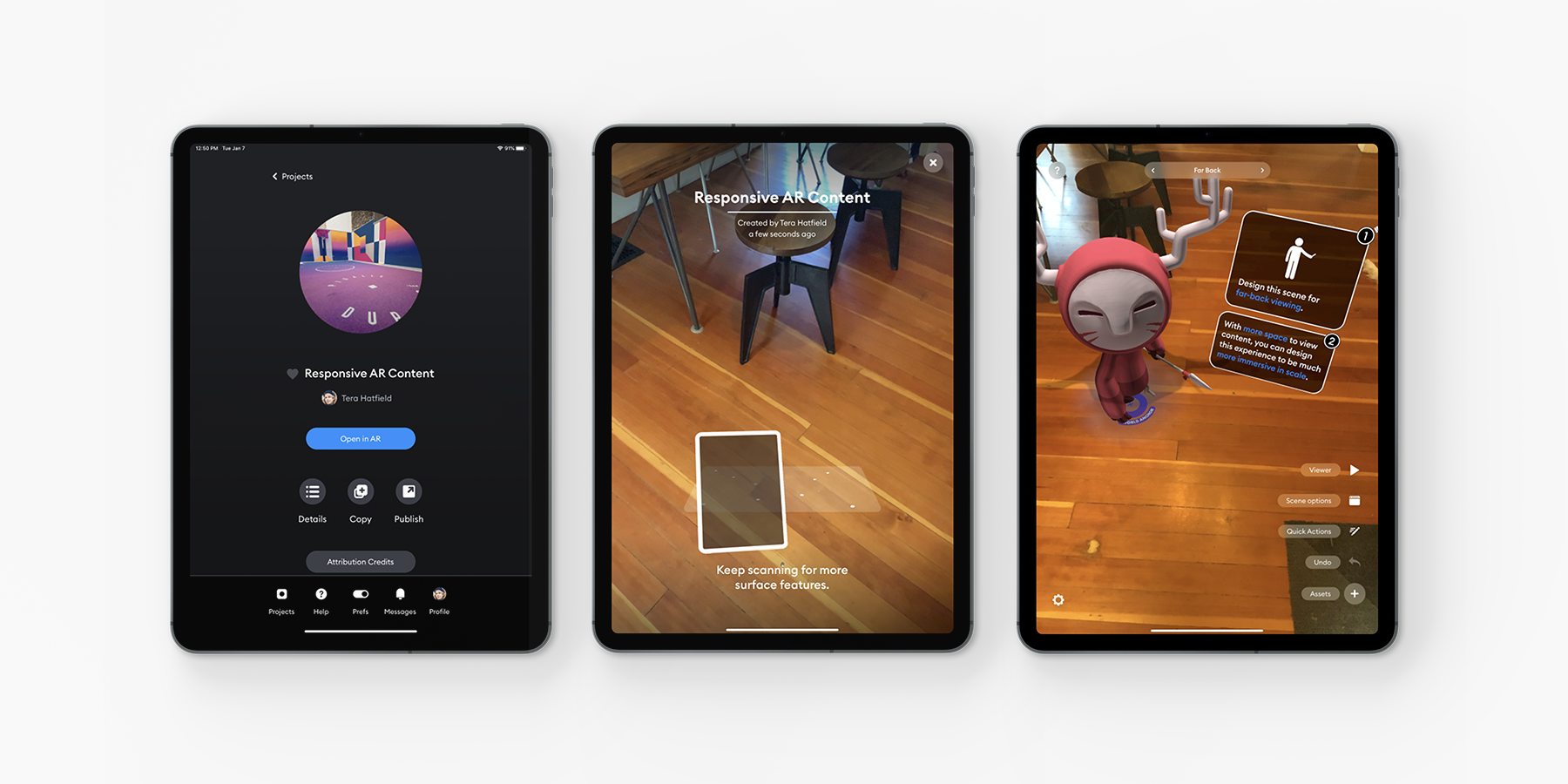
From the design environment, users have quick access to project options, as well as global app-level features.
Designers are transitioned from project details to the design environment via the camera feed. Before the project can be fully opened, the designers must first select a surface on which to drop content.
Early design resources were geared towards exploring how to abstract desktop game engine complexity to give users the ability to create powerful interactions, and animations with 2D and 3D objects in AR on a mobile device. We tested our Beta UI over the course of several months. That research would serve as the foundation for our 4.0 app release.
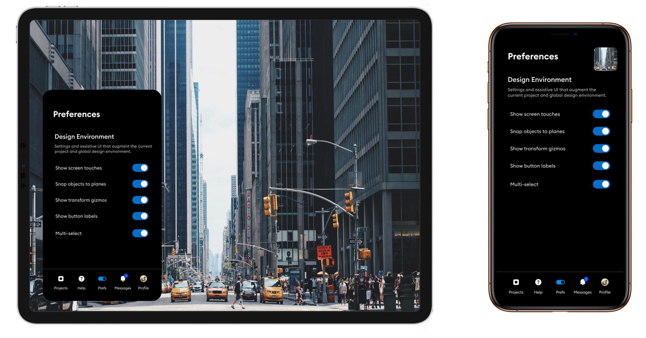
Our interface is designed to minimize cognitive load.
Torch AR is supported across phone and tablet, and our interface is designed to minimize cognitive load when jumping between the two.
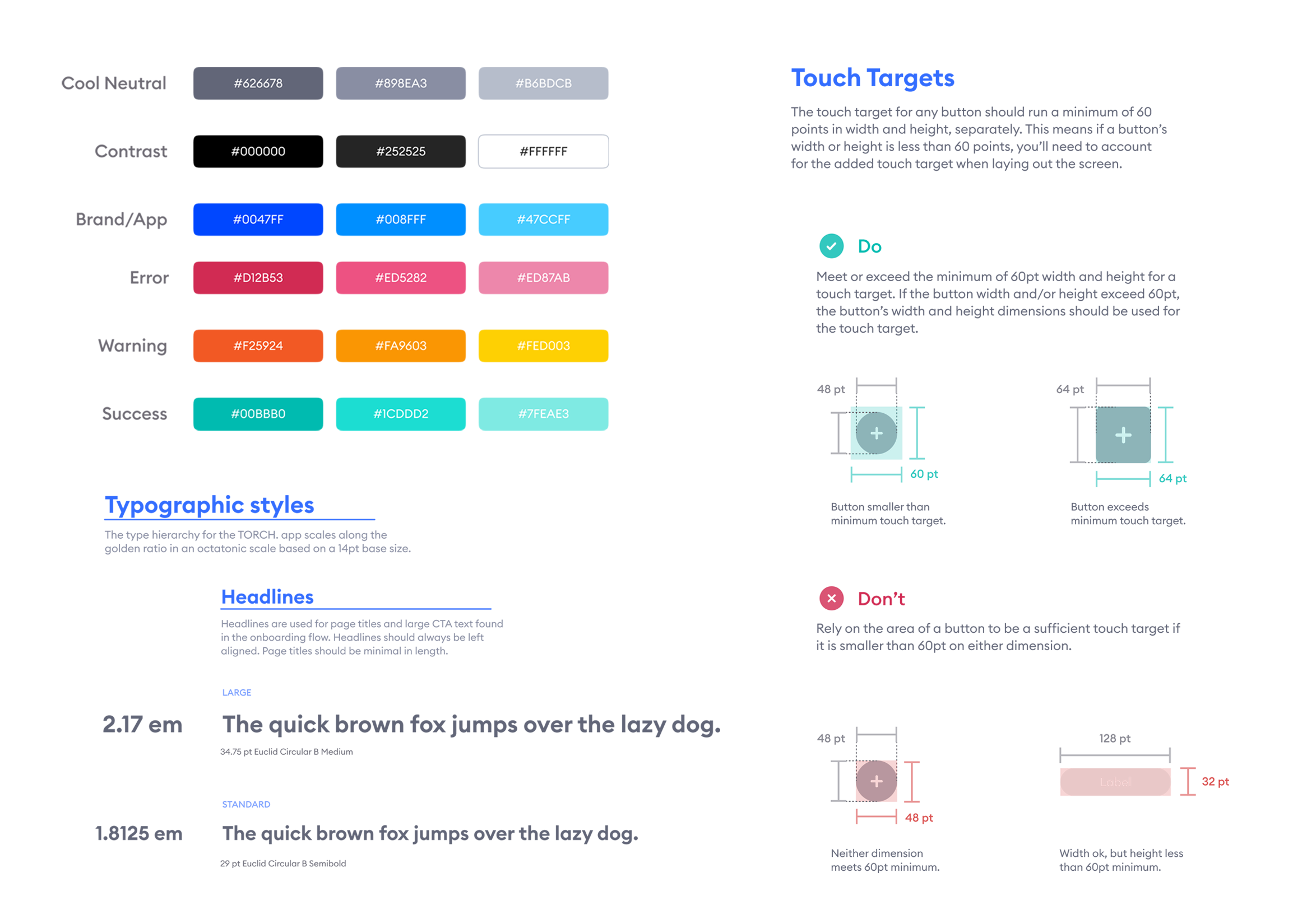
Consistent design systems speed design iteration and development.
We consolidated our type styles and buttons into a harmonic set of headlines and captions.
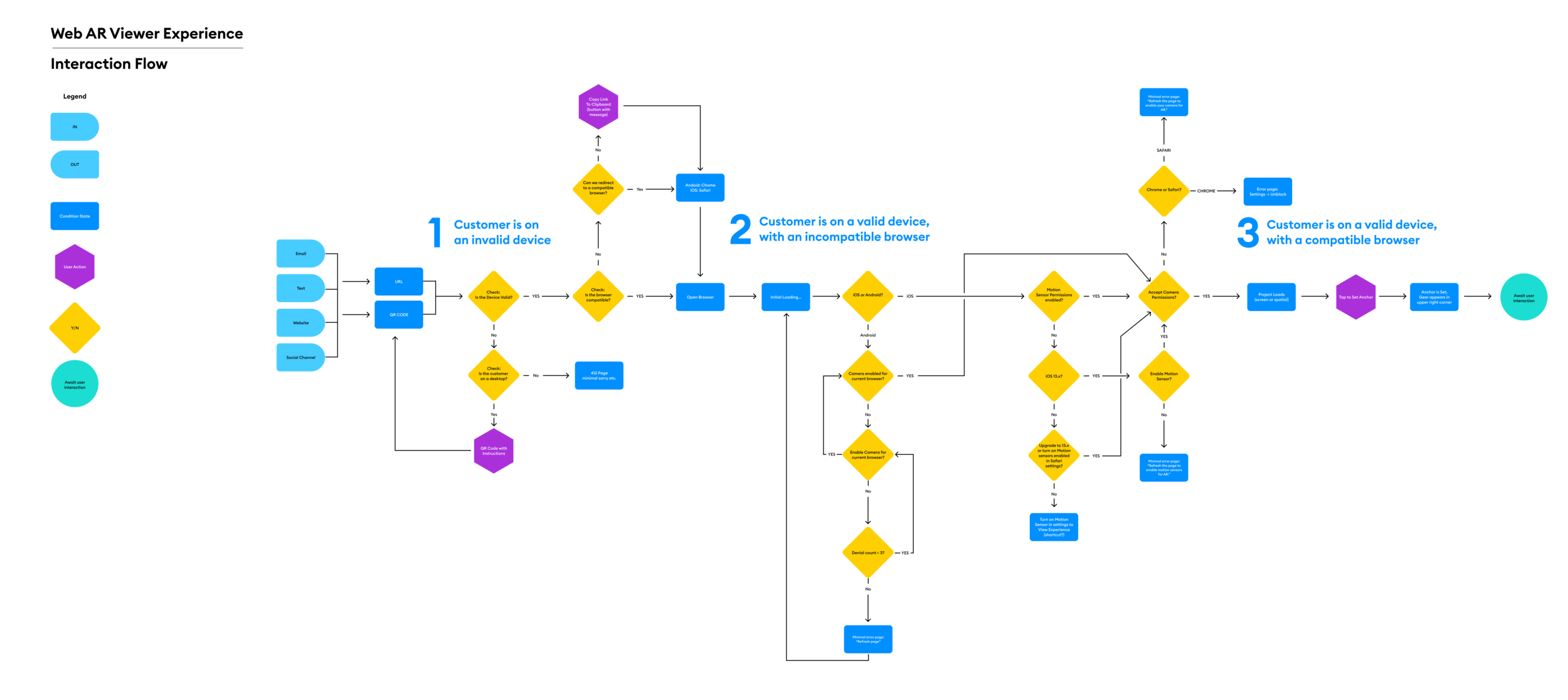
Interaction wireframes provide fine grain details about user actions and condition states.
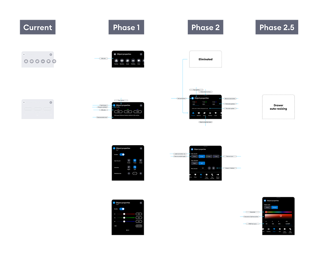
We took a phased approach to the evolution of drawer and interaction refinements.
Critical updates to UI included sheets with breadcrumbs to further reduce complexity and cognitive load. Users no longer had to go more than two levels deep while editing objects and creating interactions, ensuring users would always have a firm grasp of contextual tasks.
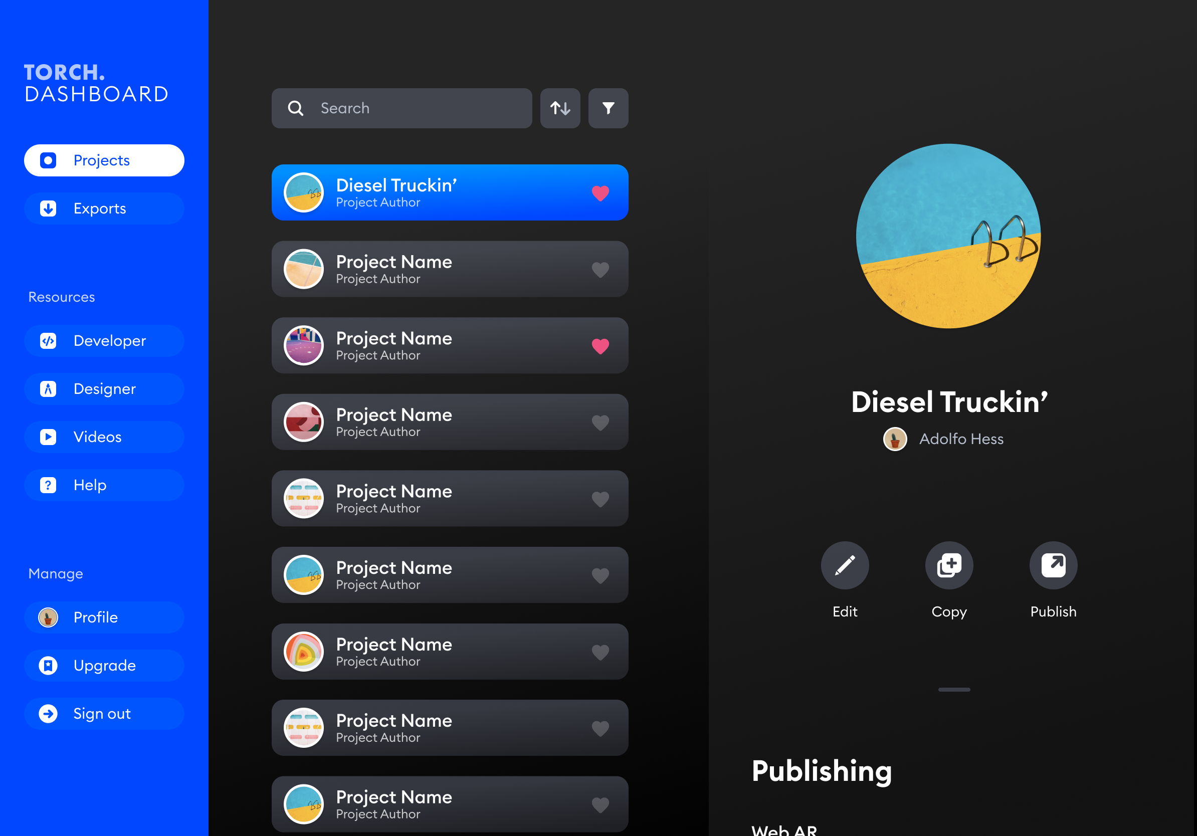
Further team account management and publishing options are available via a companion desktop and mobile dashboard.
