The Washington Post
The Post is a 144 year old storied institution that has won over 65 pulitzers for journalism. It’s one of the most trusted media publishers and comes with immediate brand recognition. However, our customer interviews revealed that advertisers did not see the paper as innovative or particularly tech savvy. The Post’s previous website was dated, perenially broken, and did not clearly articulate their brand value. Revenue and sales leads were down, along with team morale.
The Post urgently needed a platform that could forge deeper connections with advertiser exec boards (e.g. Amazon, Rolex, Hulu, and AT&T) as well as increase engagement metrics and direct lines of business. We partnered with The Post’s CRO to define a strategic North Star, clarify why The Post's B2B business exists, and why its audience should care. I interviewed clients and led all phases of the project, while also serving as a co-designer. This upfront strategic alignment laid the groundwork for us to successfully craft a robust design system and a modern redesign of their platform. We also incorporated urgently needed automated CRM features to help qualify leads.
The CRO’s primary goals were to grow sales leads immediately by 2x, create positive internal org sentiment, and reengage the team. The site generated over a thousand leads in less than 5 weeks after launch and was a huge hit with internal stakeholders.
Client
The Washington Post
Agency
Council
Role
Design Director, U/UI Concepts, Co-Designer, Account Partnerships
👀 See it live 👀
Set a compass.
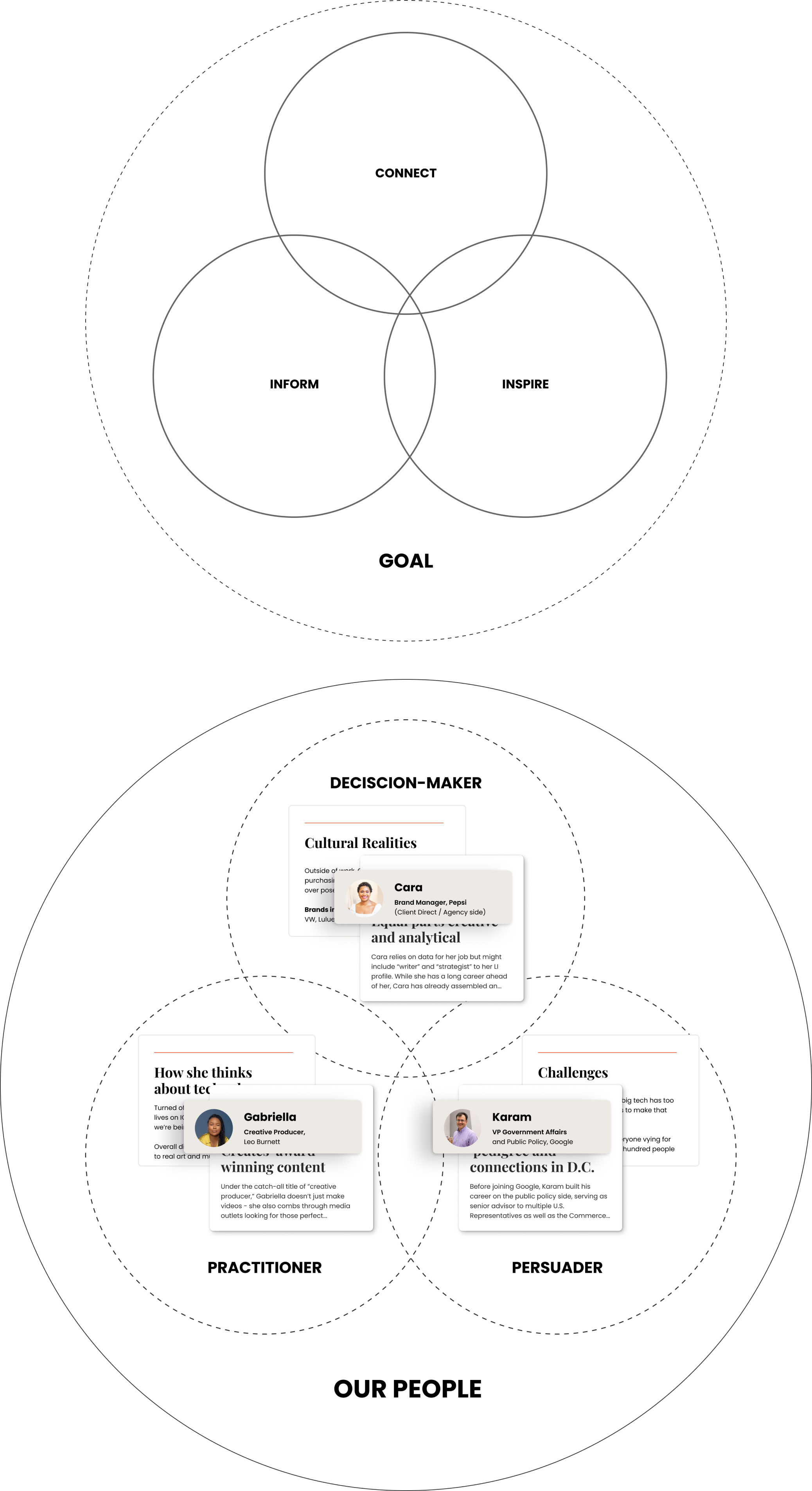
To craft an approach that drives sustained, and meaningful connections, we immersed immediately into The Washington Post’s ecosystem and worked to establish empathy maps of the audience, target audience profiles, and the key messaging that would resonate with their needs.
Build a foundation for brand experiences that connect
The primary goal was to dimensionally understand The Post’s vast array of brand partners (from fortune 100s like American Express, Adobe, Qualcomm and Hulu to SMBs and late stage startups)— real humans in unique contexts outside their 9-5 work life. This understanding then drove site-and page-level narratives that aligned with desired user journeys. We interviewed internal key stakeholders as well multinational and fortune 100 brand partners.
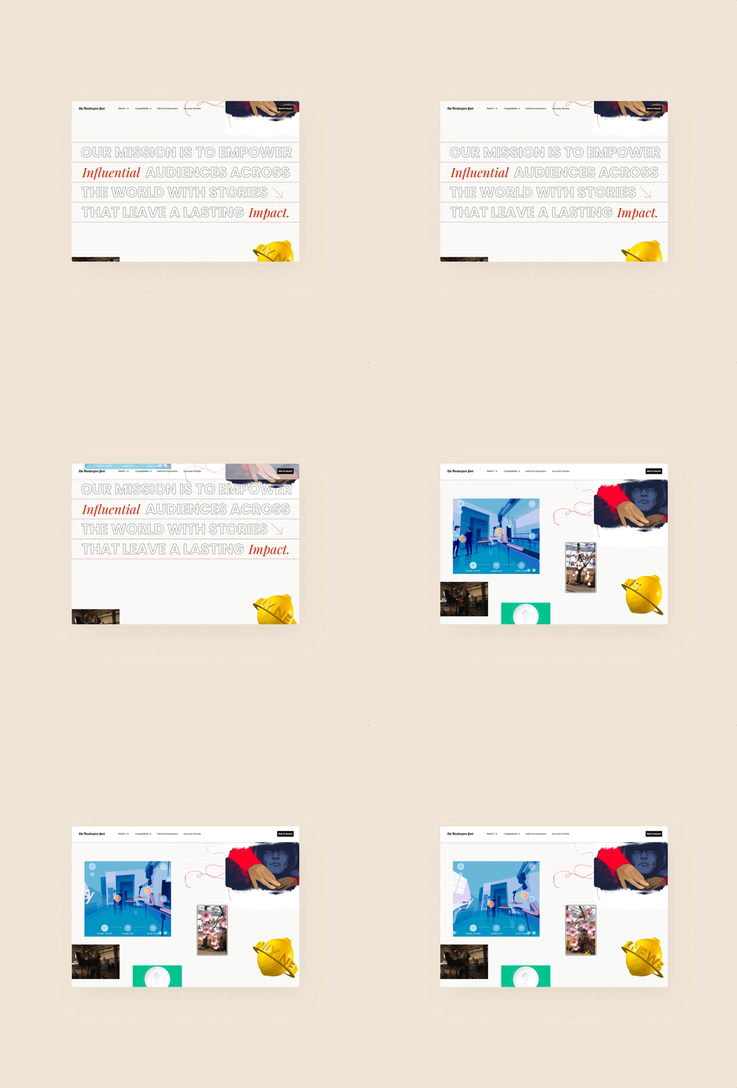
BTW: design & build a microsite in less than 6 weeks 🤙
While in the midst of immersion and discovery, the Post asked us to design and build a phase 1 microsite that could deliver—not only a beautiful teaser with real content that the advertising group could share proudly with partners, but also grow sales leads for Q4 and boost morale about the upcoming launch in Q1.
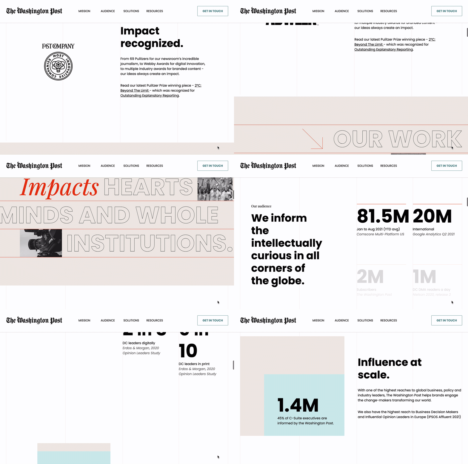
This request allowed design and development to collaboratively move quickly and work iteratively. You can see the teaser until end of year 2021 via washingtonpost.com/solutions.
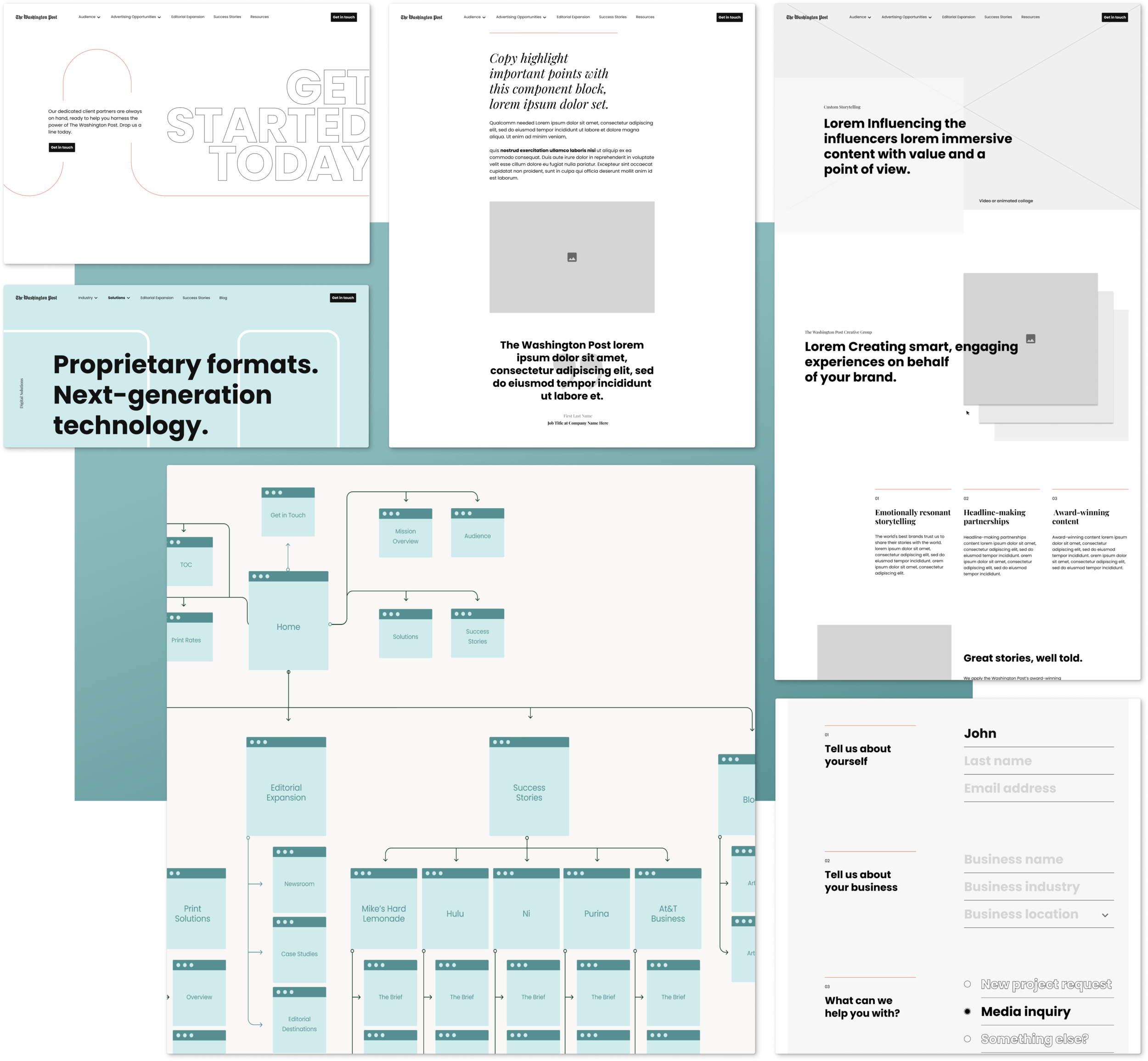
Architect a narrative framework
We crafted a new narrative experience from scratch that re-frames the Washington Post as an innovative and influential partner, leveraging product strategy to inform information architecture, user flows and UX wireframes that quickly drove our iterative development process forward. This new structure provides compelling immersive content that is both easy to navigate while also arming buyers with the tools and knowledge they need to bring their programs to life.

Create the visual language that reflects the vision
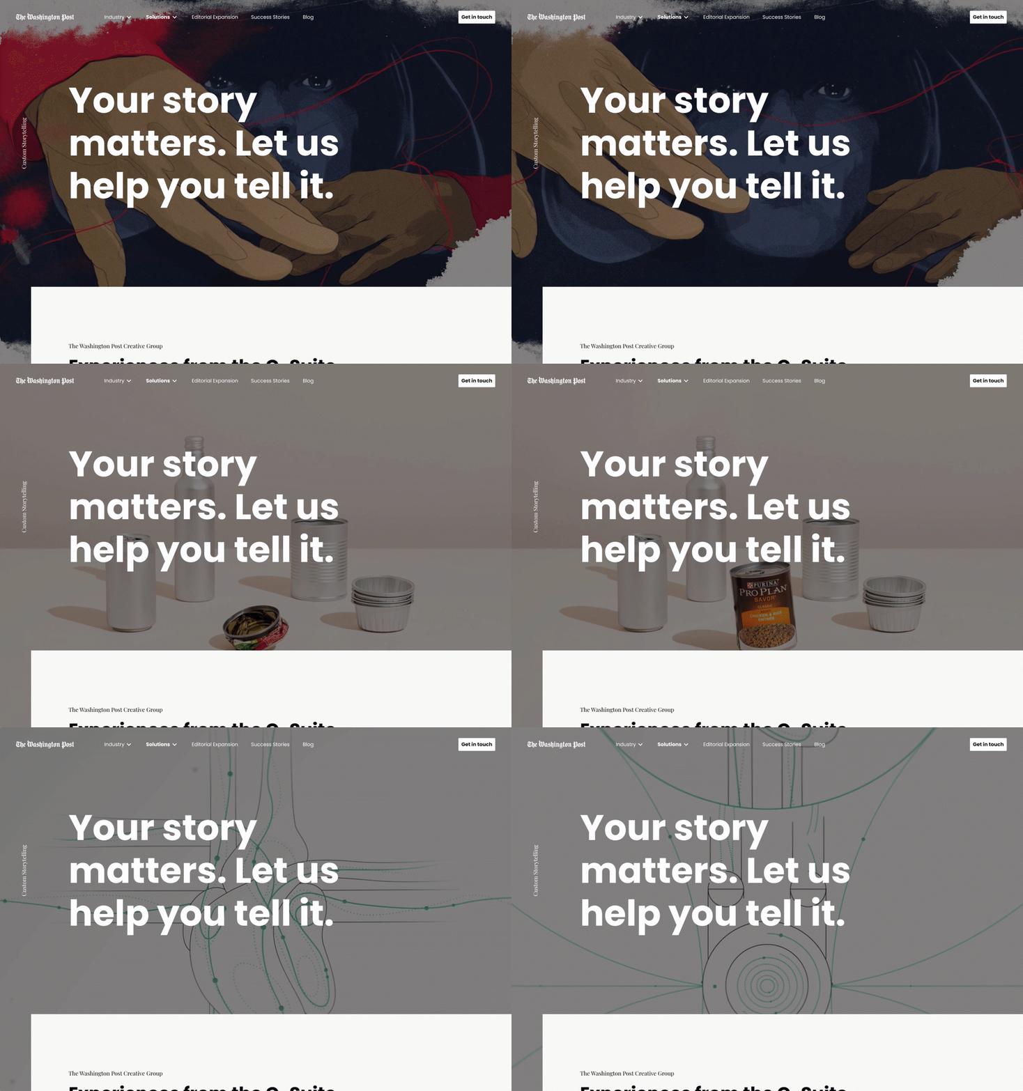
In collaboration with The Post’s development and design team, we built and expanded upon how The Post visually expresses itself online (through color, typography, photography, illustration, and motion). Limitations in the use of editorial images provided an exciting challenge to bring Washington Posts products and platforms to life through fresh typography, motion, and interactions.
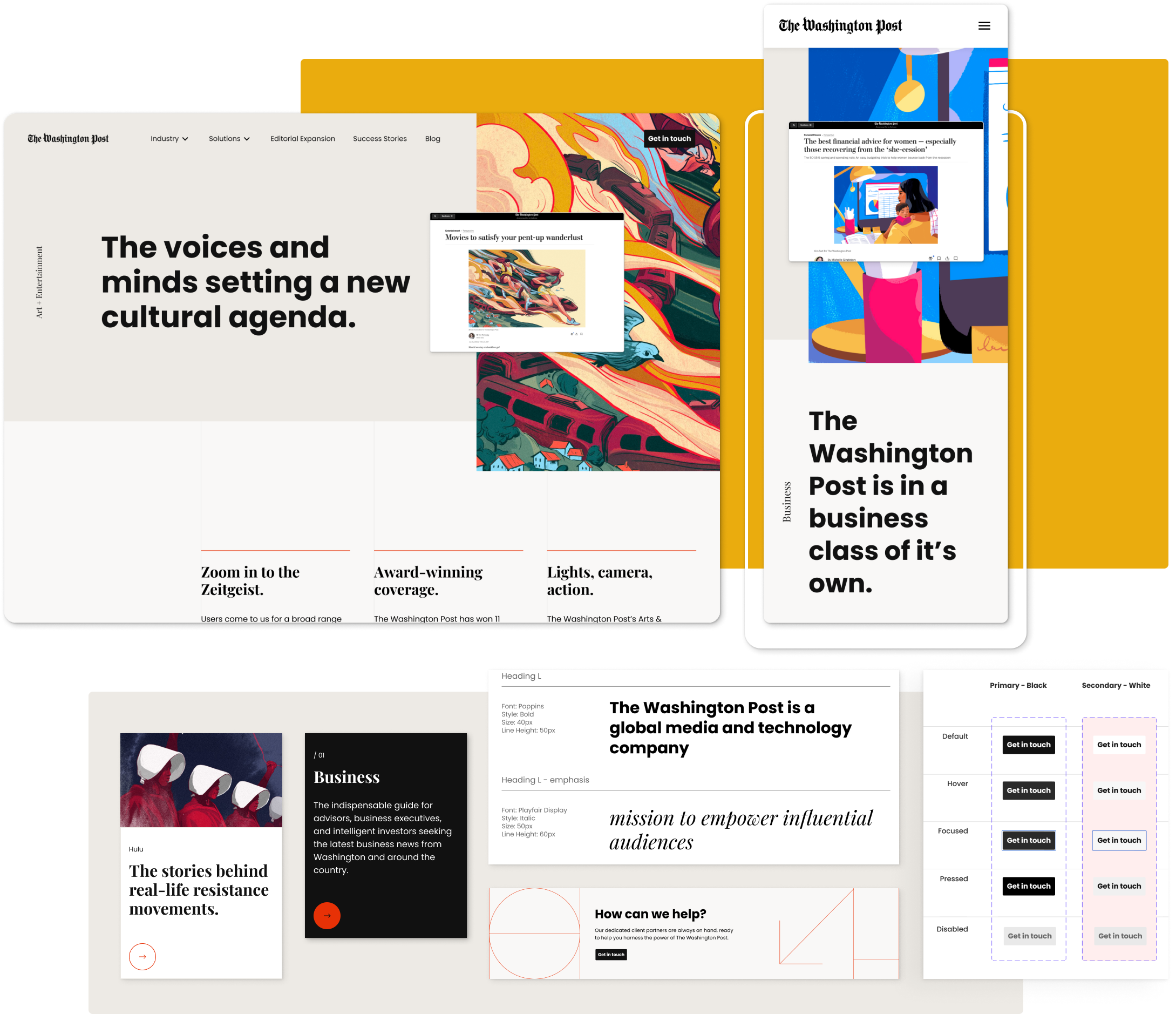
The UI system is built using the principles of atomic design, which allowed the development team to quickly build react components and page templates. Design and development iteratively tested components using Storybook.
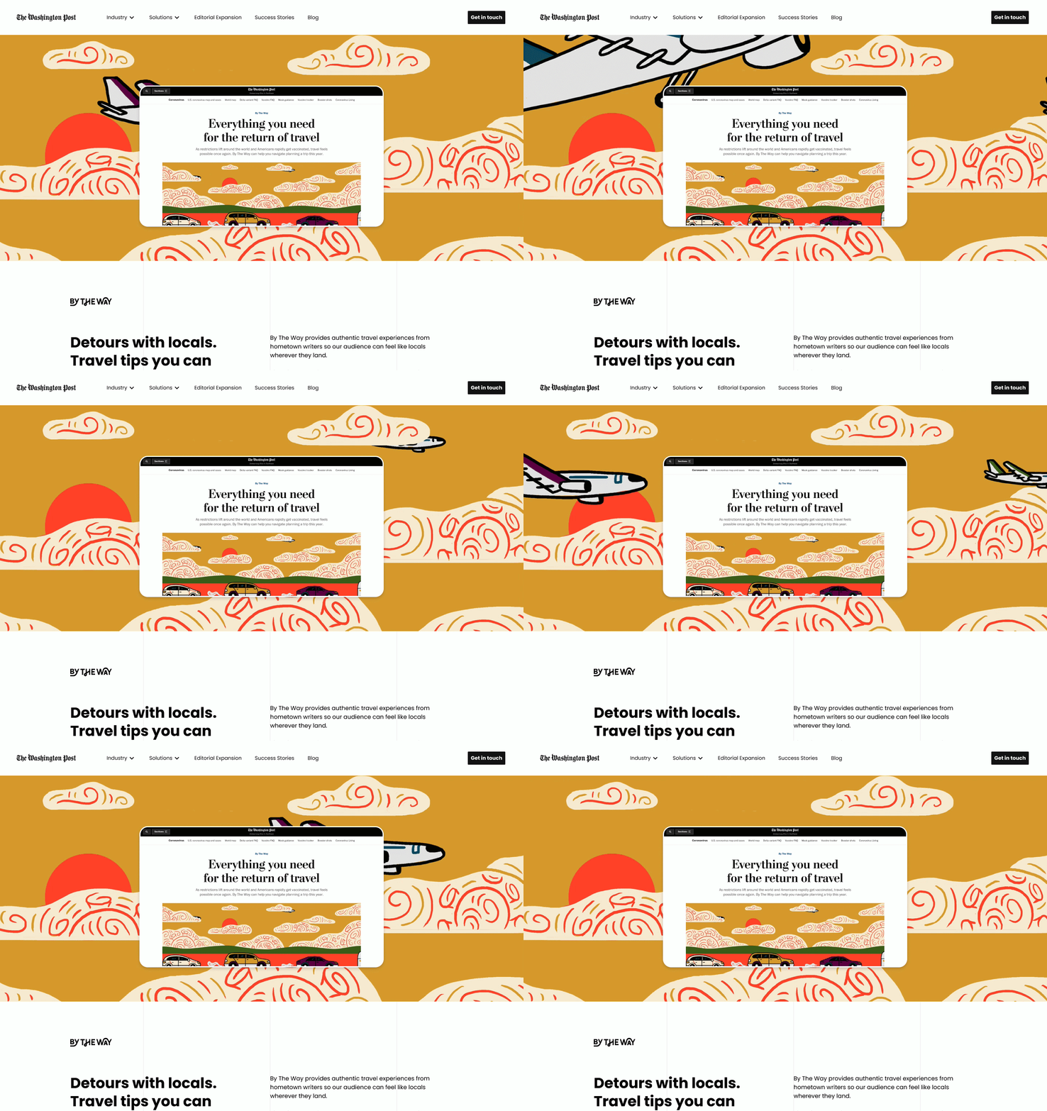
The team endeavored to find a way to respectfully bring content to life in a way that felt true to the brand. Above is a frame from a motion prototype for the phase 2 website.
Bring the message to life across the brand ecosystem
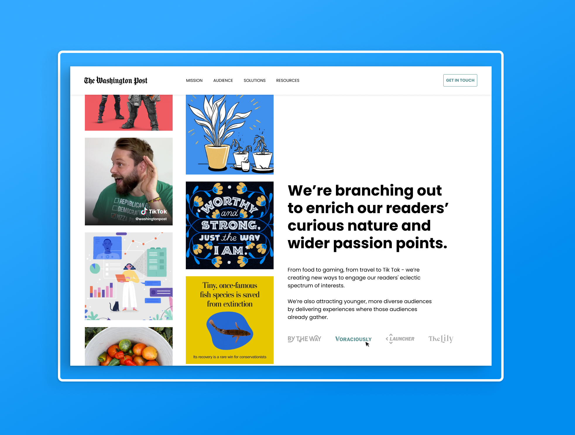
Through a series of design sprints, we turned our information framework into an accessible and intuitive immersive experience that will draw people in and inspire them to connect with the Washington Post. The UI design library we built will also serve as a blueprint for future interactive touch points and data visualizations.
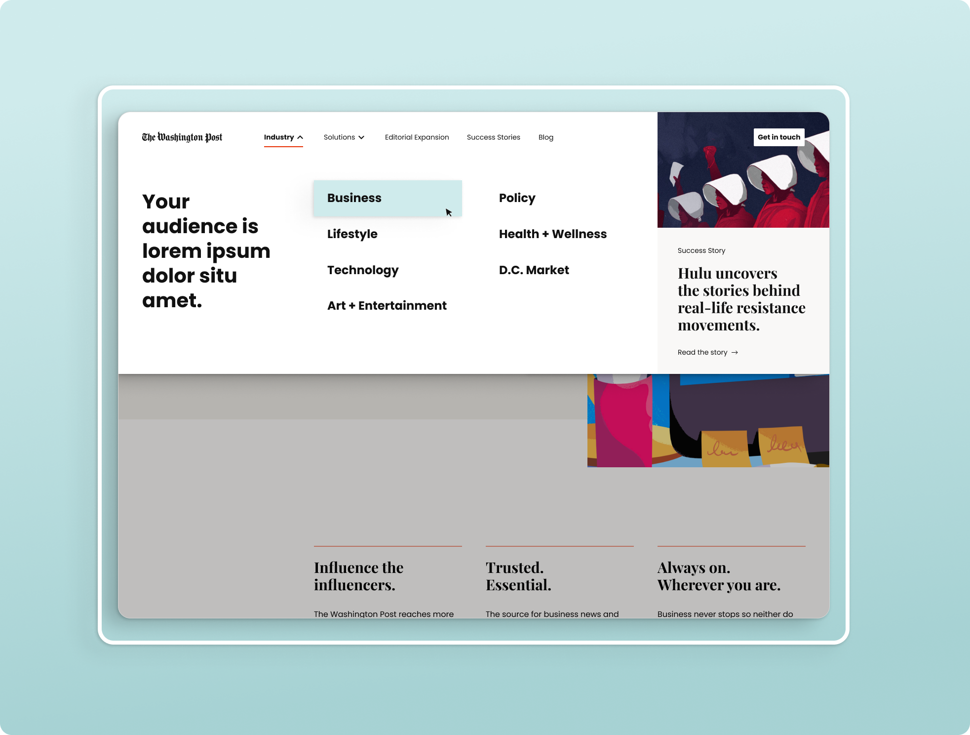
Final UI navigation for phase 2 website, which allows for messaging and content highlights relevant to core industry pages.
